Council Compare - how well is my Council performing?

Client:

NSW Office of Local Government

My role:

Client relations

Research

Ideation

Concept sketches

User testing

Wire-framing

High fidelity screens

Overview

The NSW Office of Local Government approached Komosion to create a tool that enables councils within NSW to compare their annually submitted data with up to three other NSW councils across six broad categories, going back three years.


This compared data can then be visualised in both infographic and tabular format, with limited export functionality available. The user demographic included new businesses, the general public, state departments and jurisdictions and students doing reports as part of their studies. We need a user-friendly graphic display with capacity for future expansion with more data points added.
How well are Councils providing to their communities?

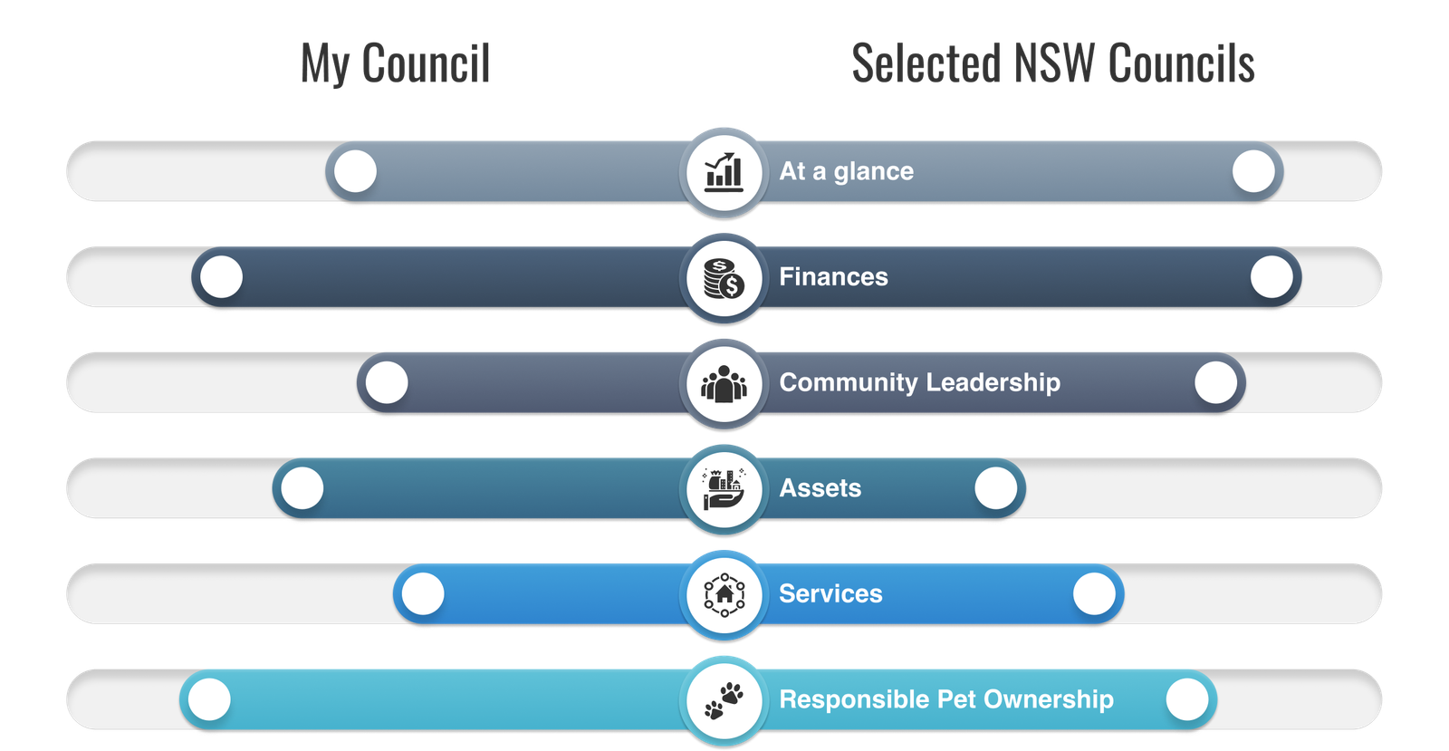
Our research process involved interviews with several subject matter experts at the Office of Local Government. In addition, a Miro board was created and shared with the interviewees, who each completed a card-sorting exercise to determine the broad themes under which each metric would be listed. This process revealed the following categories.

Feature prioritisation

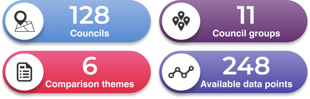
The initial scope included the comparison of all 248 data points, viewable in both infographic and tabular format, with the functionality to export data sets as both PDF and CSV. 

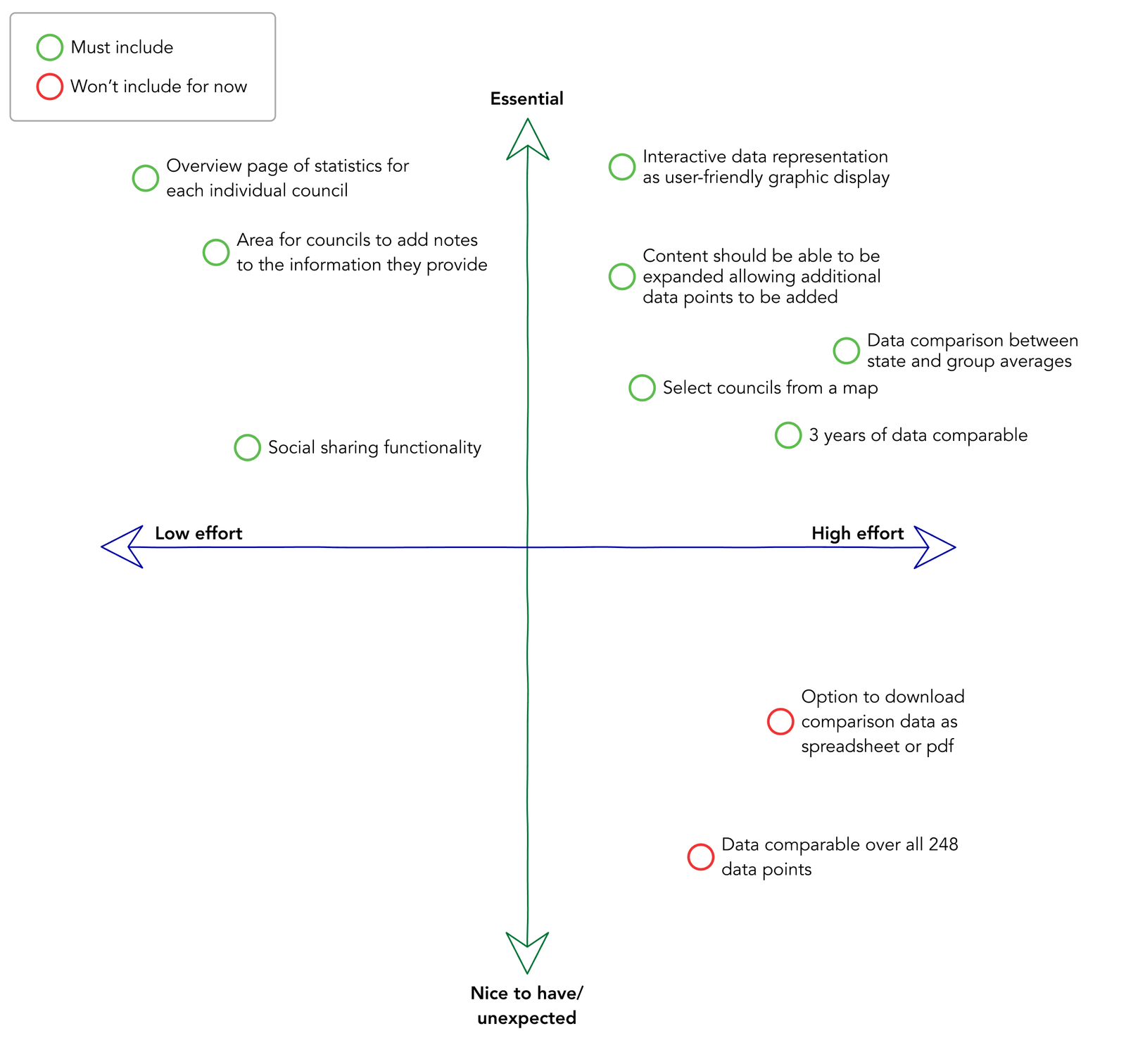
It became apparent that including this full set of features would far exceed the Client's budget. We undertook a value engineering exercise to reduce the scale and complexity of the build and to role it out in two phases.

The initial phase included the essential functionality of the comparison tool, but dispensed with features such as data export, which were seen in user research as nice to have, rather than essential. We also reduce the number of comparable metrics from 248 to 60, allowing for further expansion in the second phase. 

These measures enabled the project to proceed on time and on budget.

Final UI

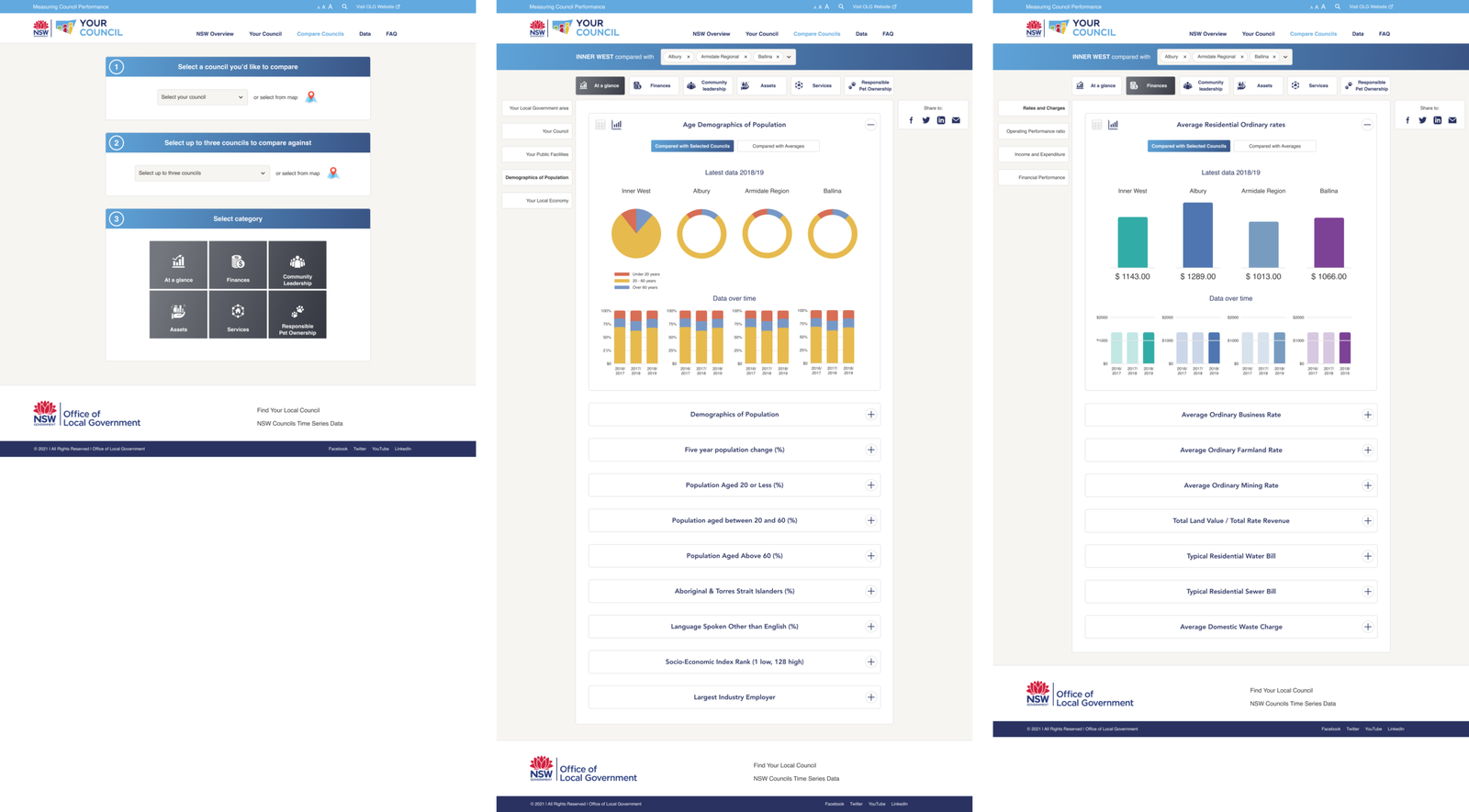
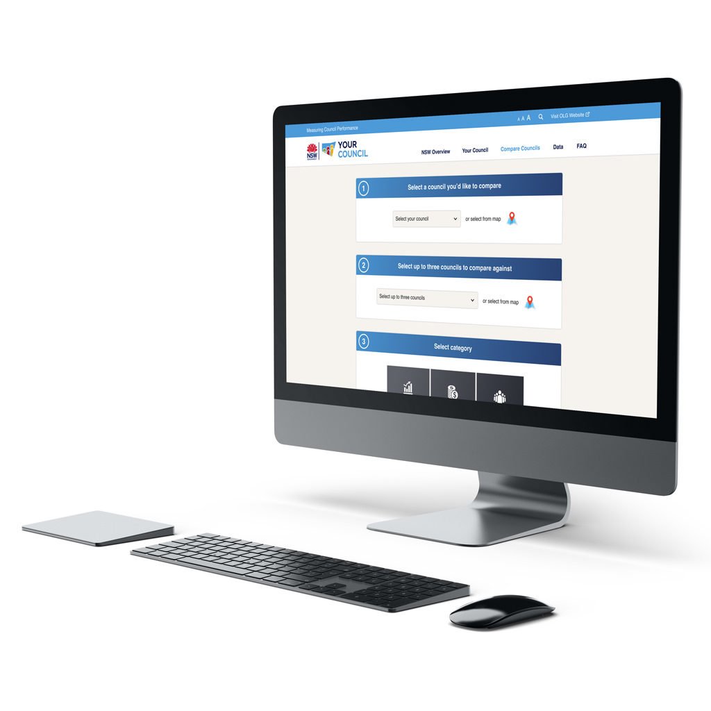
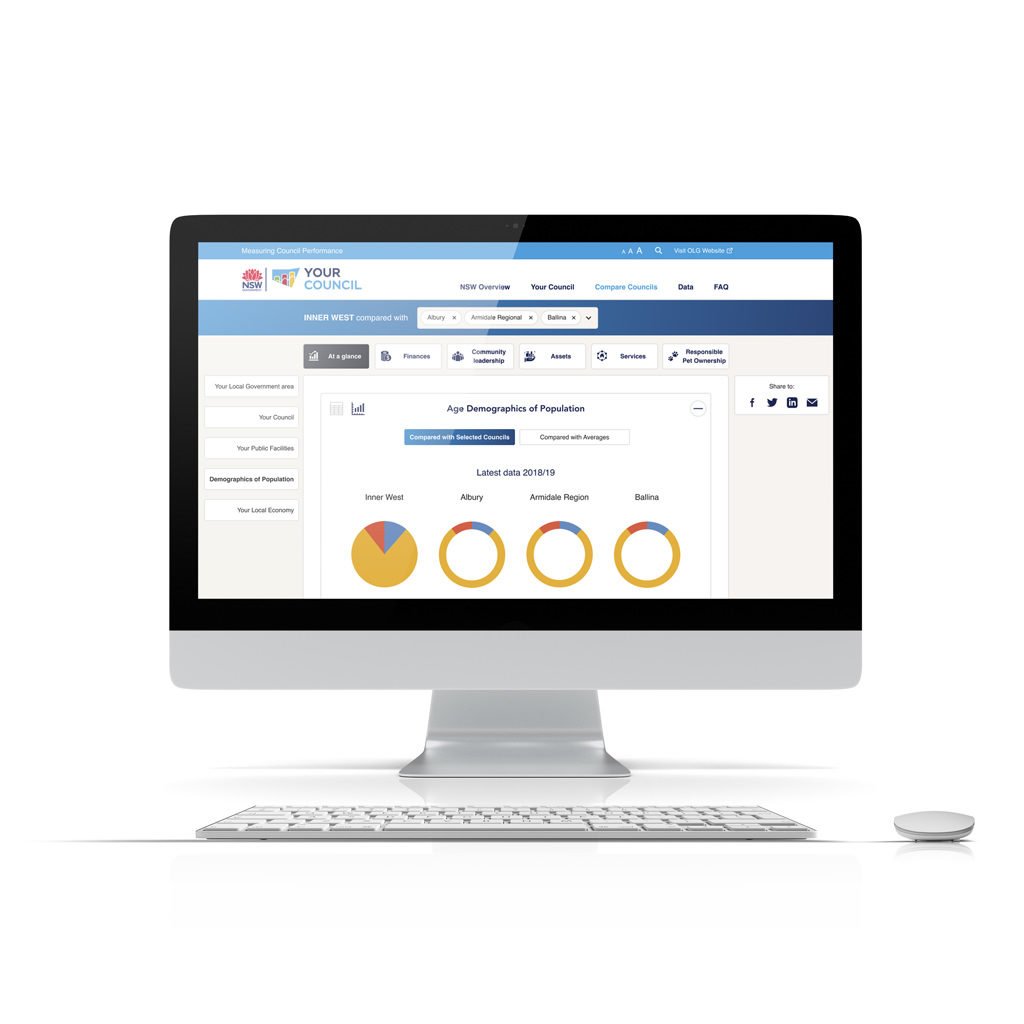
The final User Interface of the high fidelity screens was designed to maintain consistency with the existing Office of Local Government pages. This is reflected in the selection of fonts, colours and other UI elements.

The user experience was further enhanced through the use of accordion elements to reduce visual overload, a clean dashboard interface, and a simple step-by-step user flow. 

Final prototype